The Style Ref Brand Refresh
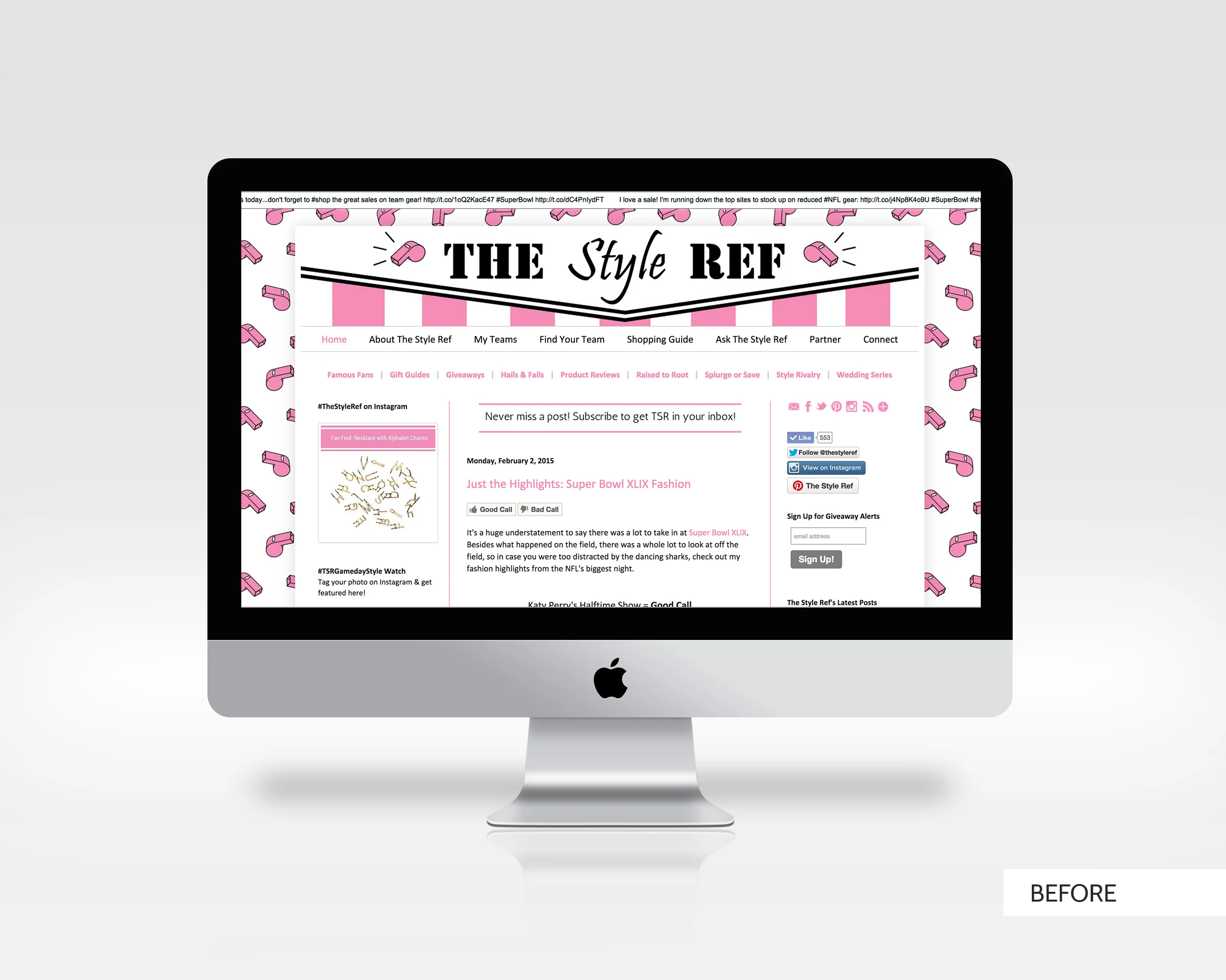
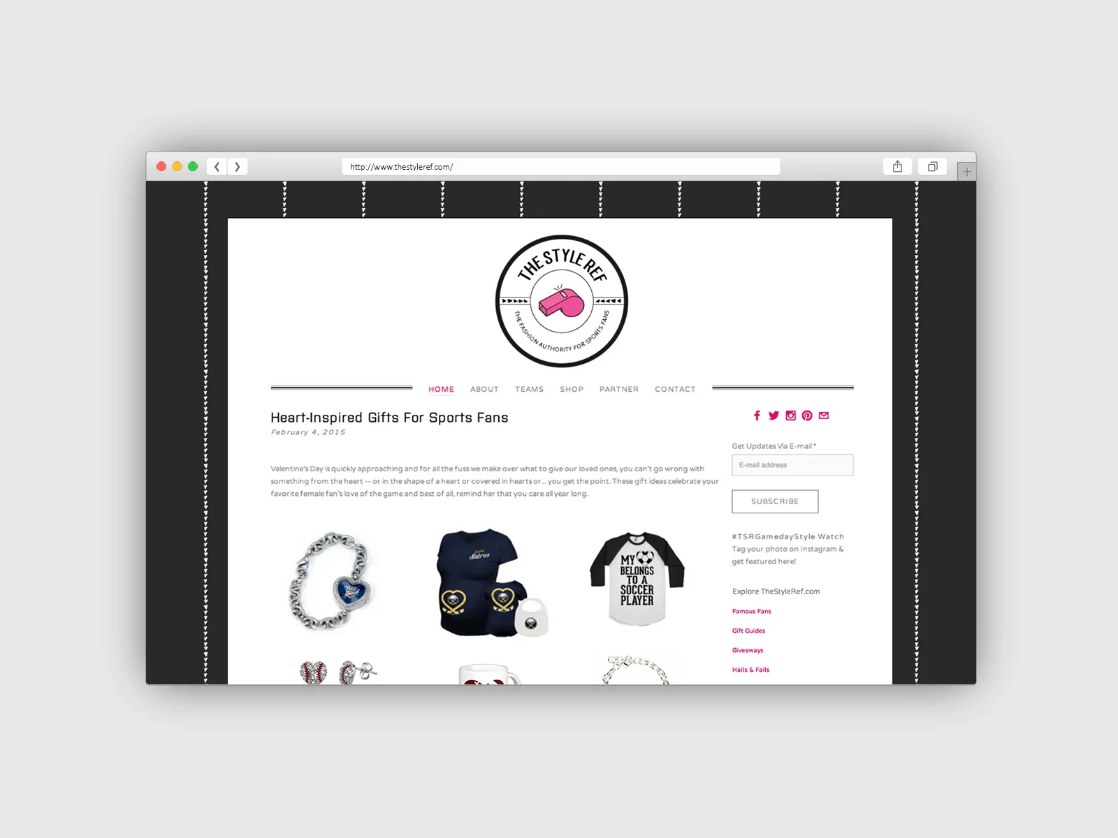
The Style Ref, created in 2011, is a blog about fashion for sports fans. The blog has grown and matured over the last 4 years, gaining followers and attention, and now the brand and web design needed to mirror that growth.
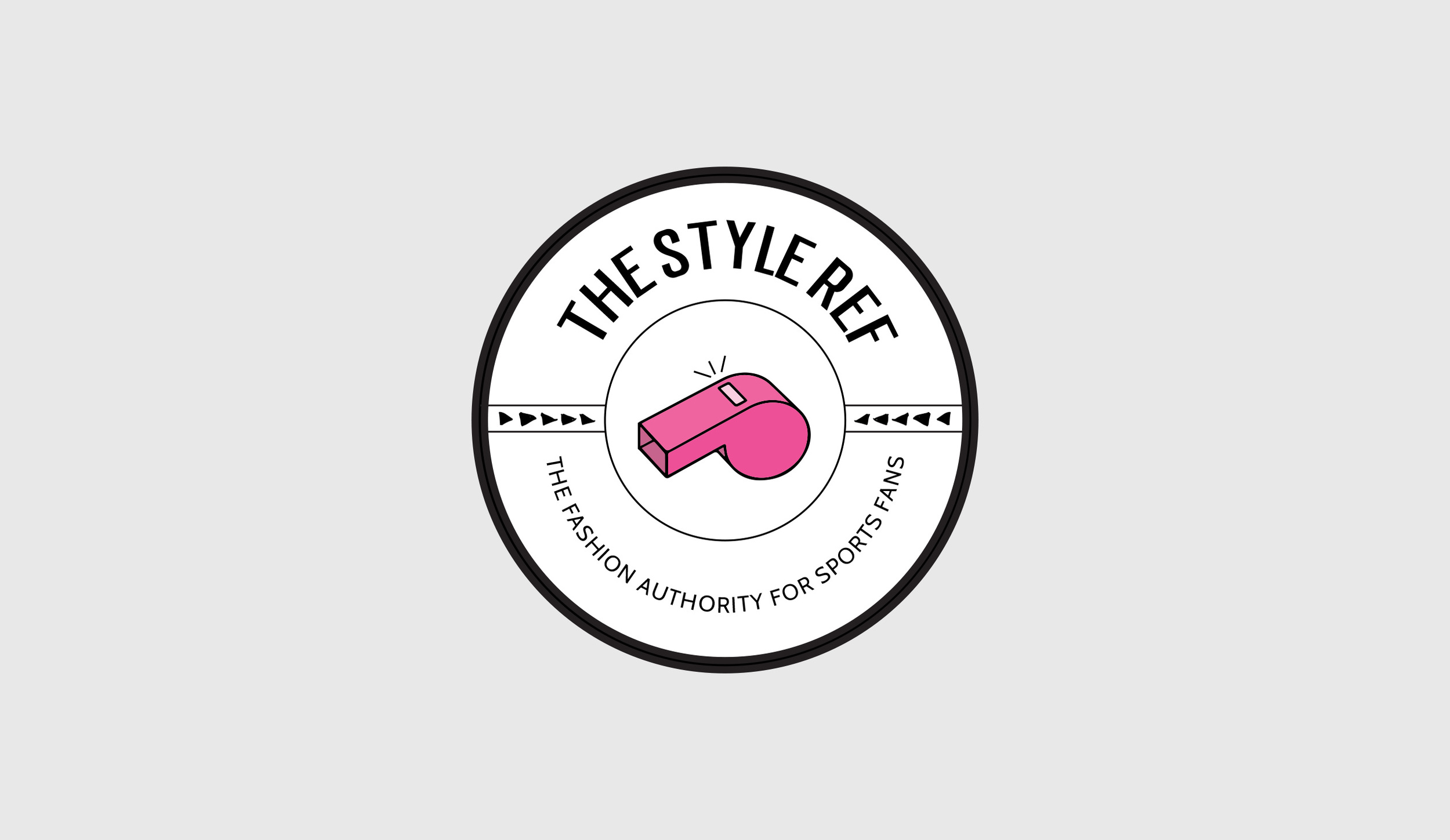
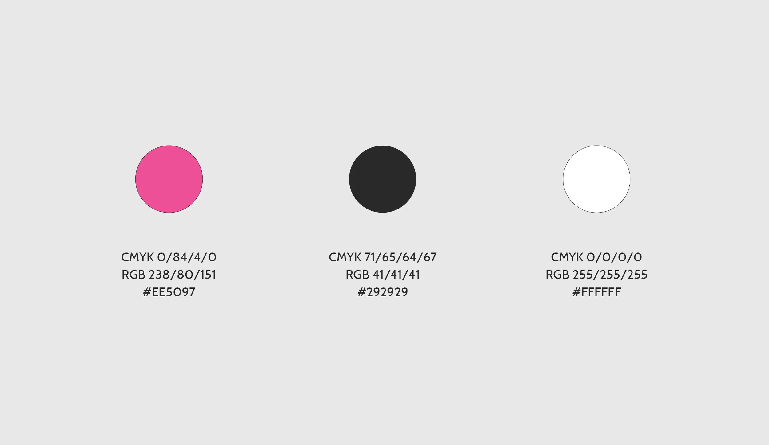
For the logo, in order to keep the brand recognition, the whistle remained the main identity graphic. I adjusted the pink color from the pale pink to an edgier, bolder pink and replaced the script font with a sans serif font that alluded to sports, while remaining soft and feminine. I also introduced the hand-drawn triangle pattern that is visible in the website background and is used throughout the blog to highlight important content.
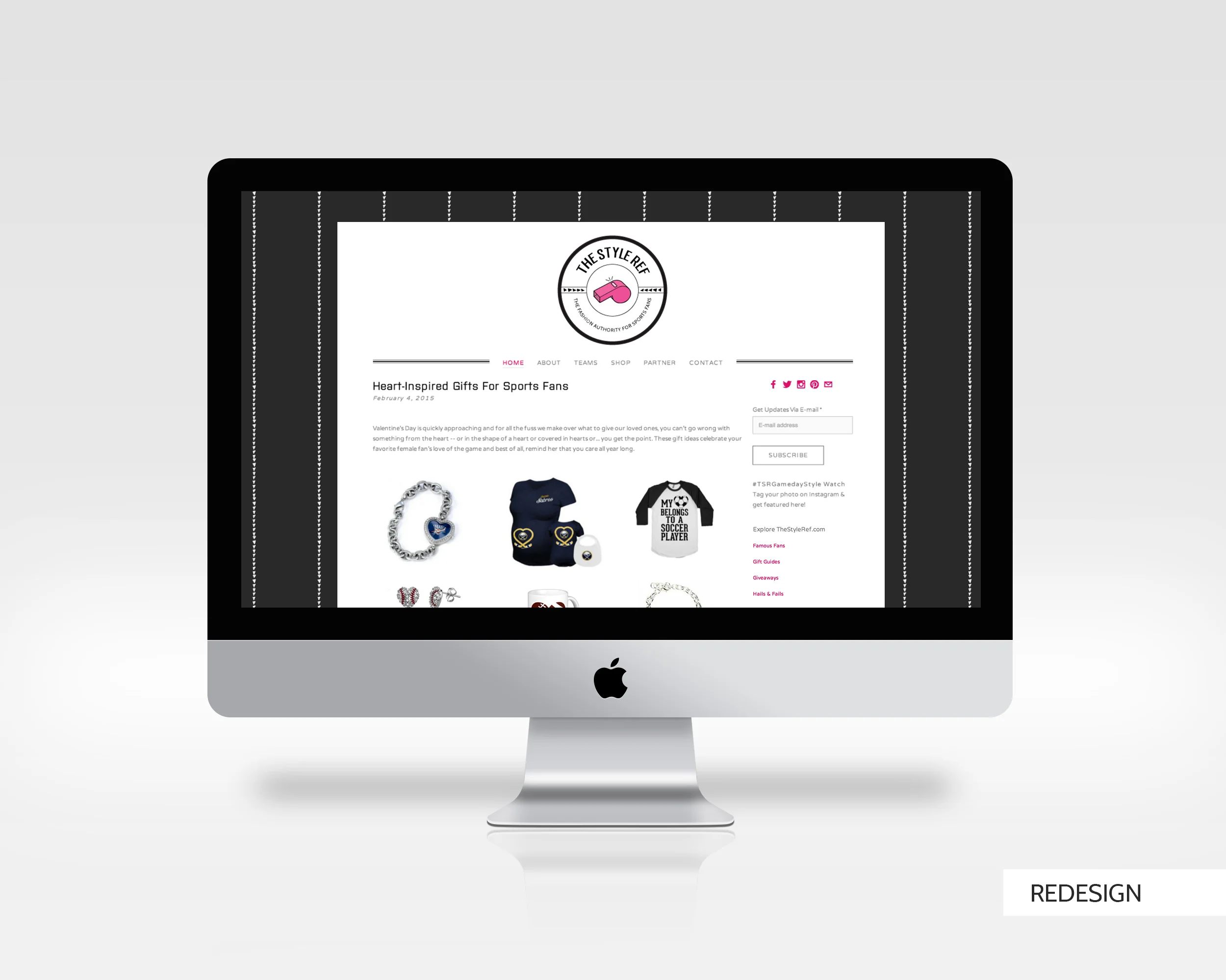
In terms of the website design, I stripped out all of the unnecessary and distracting elements, like the news ticker at the top of the website and the multiple navigations and buttons, and streamline the design so the user could focus on the blog content and navigate with ease. For the imagery within the blog, I introduced a grid pattern to make the content organized and easily consumable.