Stacey Warthen Design
For the first time in USO history, the annual report was designed and written solely by in-house teams. Using a new design and storytelling, the report introduced the new direction for the brand to all key stakeholders.
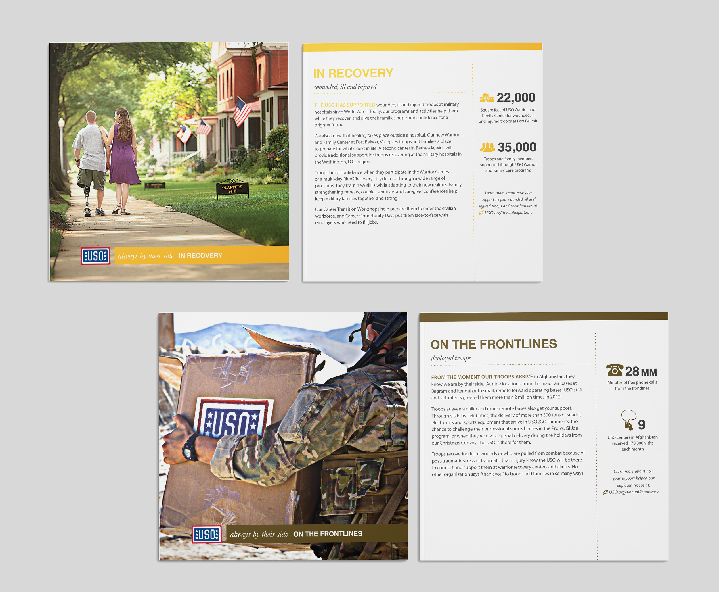
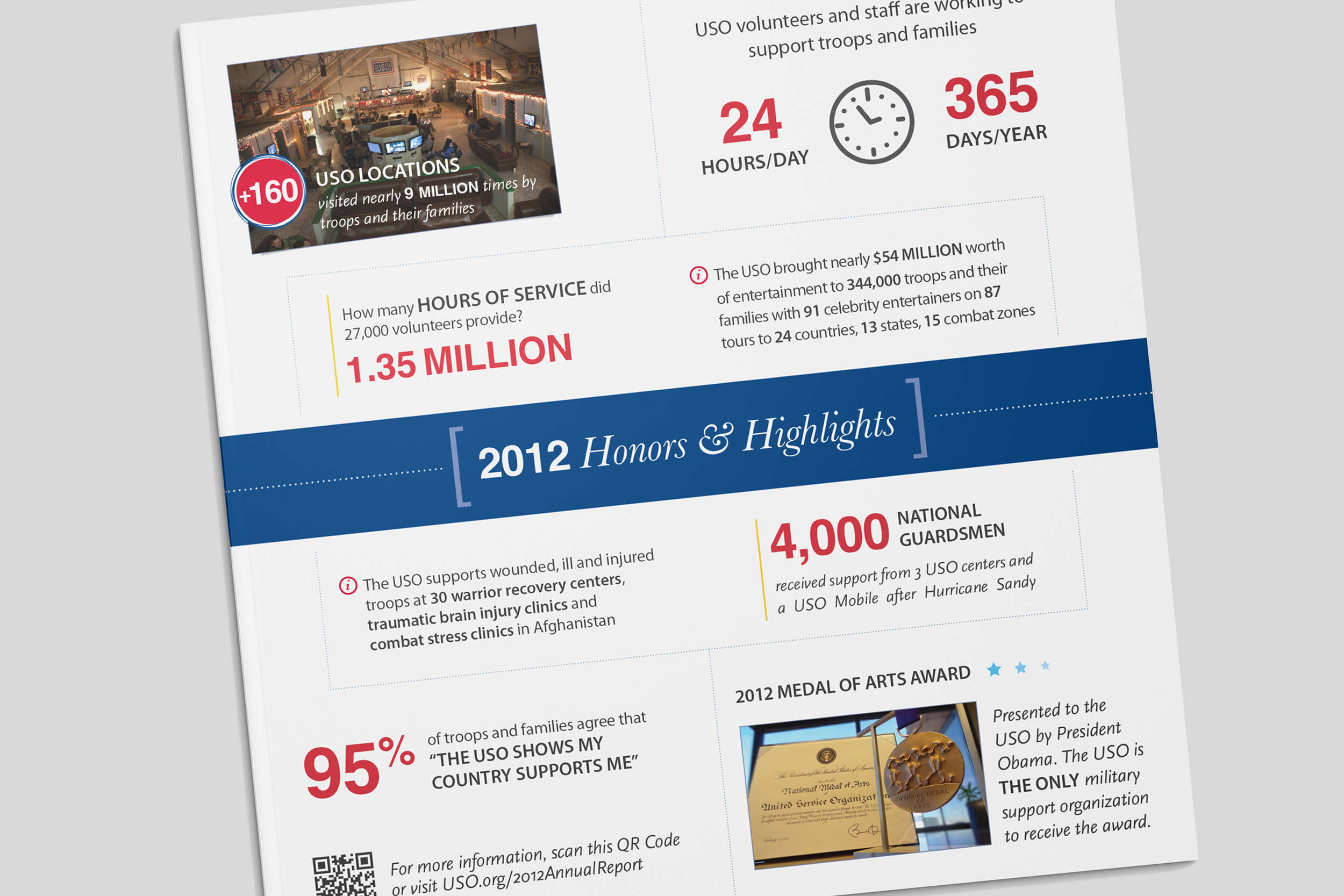
This annual report was a multi-piece, interactive report, including a folder that held both a booklet and story cards. The booklet featured critical financial data, donor statistics and an interactive map that highlighted the impact of the USO around the world. The 5 cards told a detailed story of each audience that the USO serves, paired with data points and testimonials. There is a rectangular cut out on the right side of the folder, which allows the card title to show through. We varied the visible card depending on the target audience receiving the package.
The design was translated into a website for greater accessibility and a wider range of use.
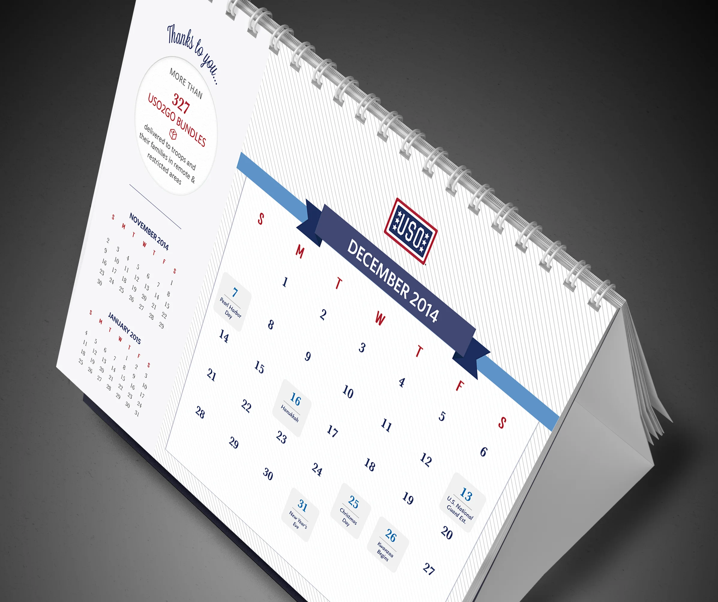
For this project, I refreshed the look and feel of the USO brand by creating a bold, new color palette, selected new typography and created new graphic elements. This new style represents the strength and reach of the USO and has a simple, clean design that appeals to new target audiences. I applied this new style to all of the corporate and marketing materials, including the letterhead, business card, one-pagers/flyers, brochures and special projects, like the annual tent calendar.
The business cards were designed as a set of 4. Each card in the set has a unique second side and together the cards represent the audiences supported by the USO. The calendar highlights the troops and their families and the services the USO provides through powerful imagery and testimonials. Each month gives the viewer a feeling of inspiration and gratitude.
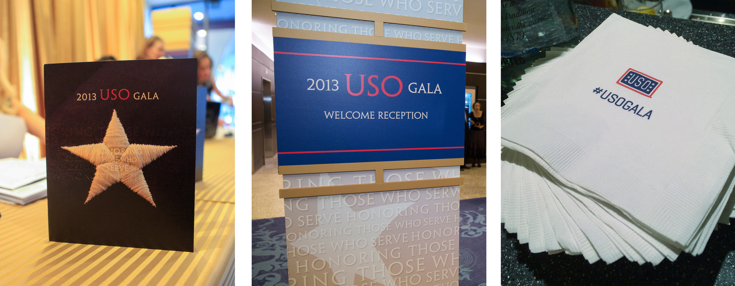
On October 17, 2013, the USO held it's annual gala to honor service members from each branch of the military. The attendees range from honored military guests and celebrities to corporate partners and White House guests. As the lead creative strategist and designer for the event, I conceptualize and design various decor and print elements for the event. These include presentation slides, large column designs, products and event collateral. For this year’s event we included a special product, a vintage viewfinder, which displayed 3D slides of the journey of the USO, their mission and who and where they serve.
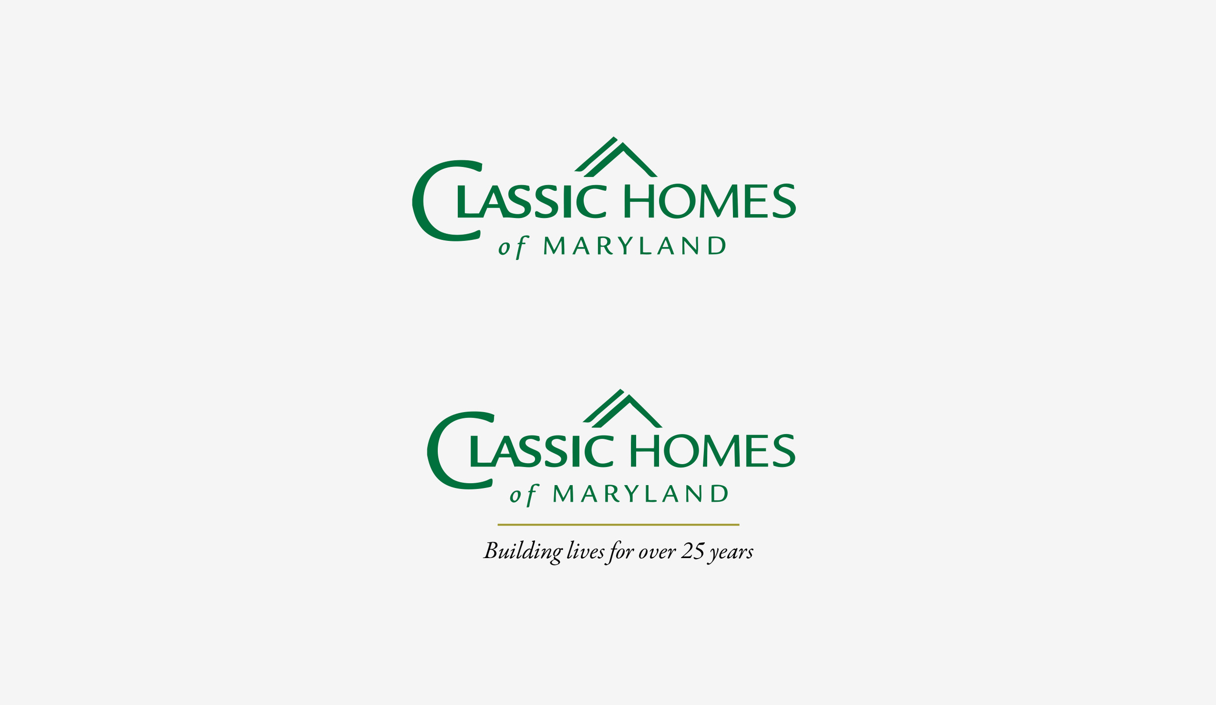
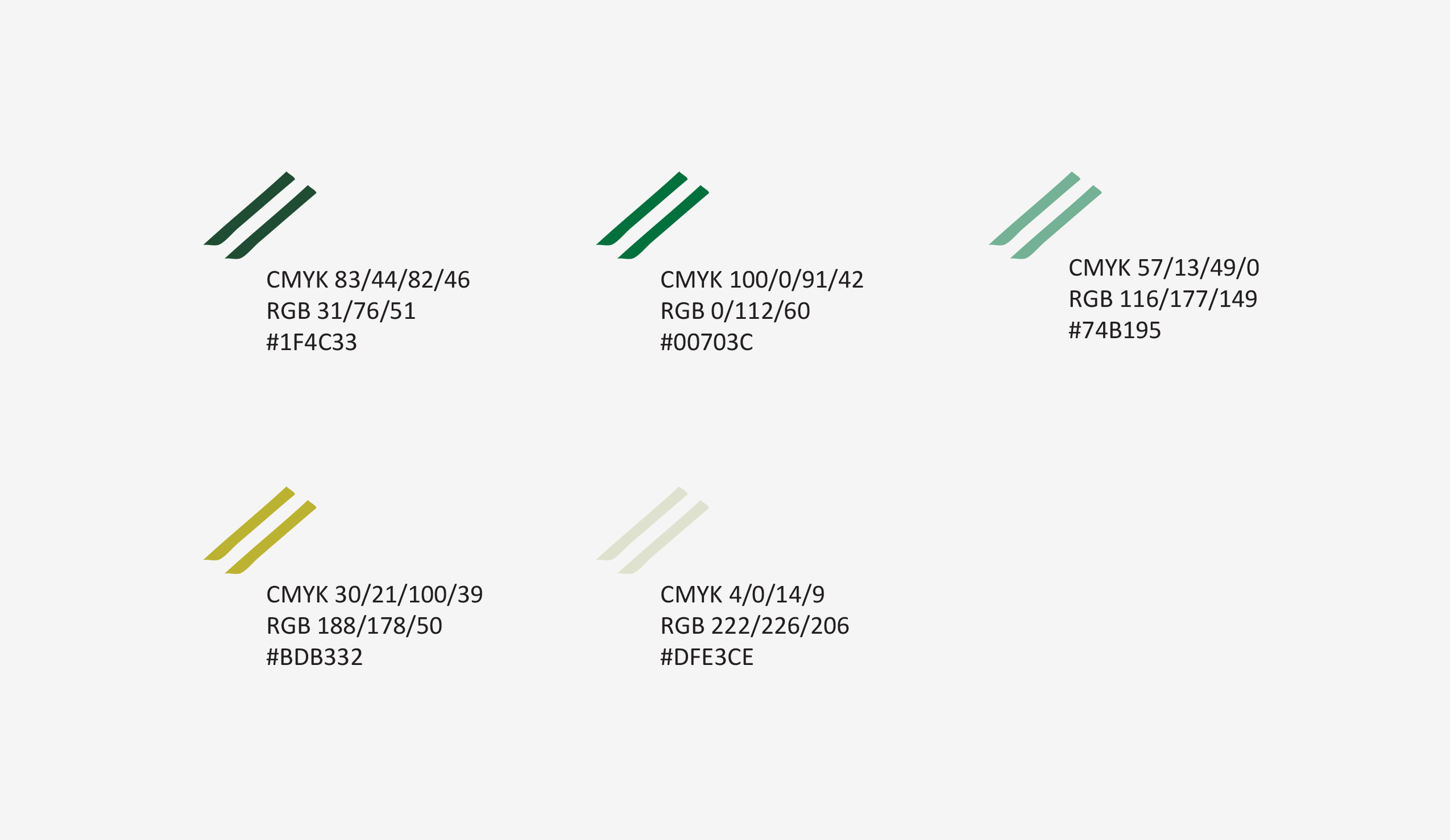
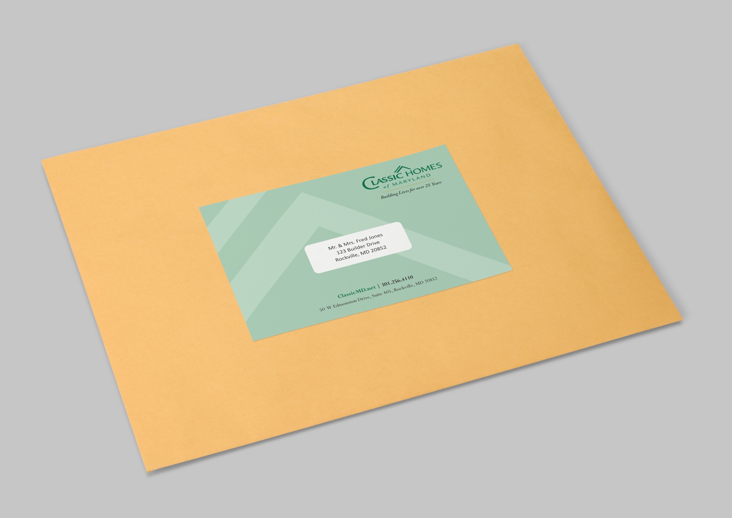
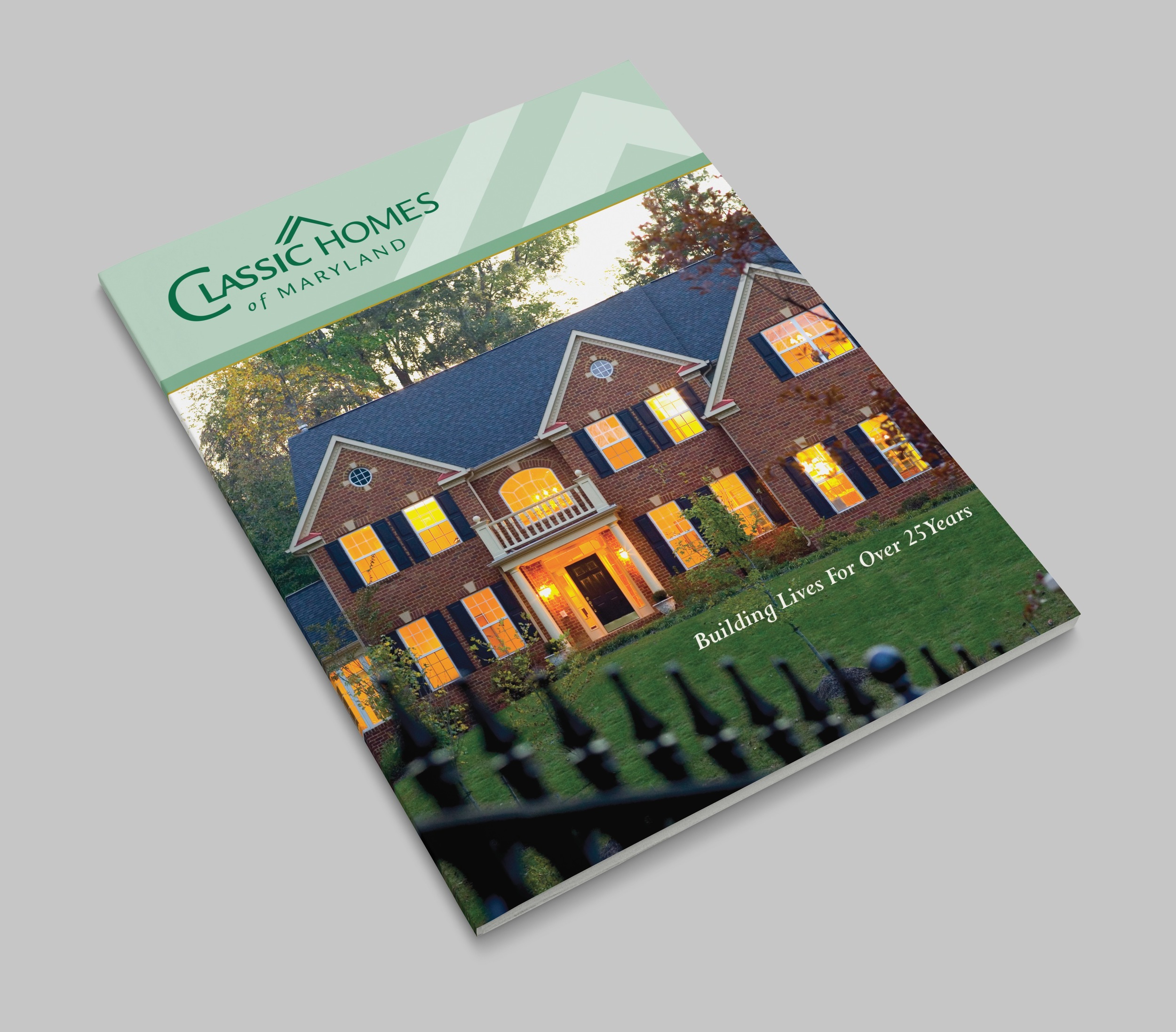
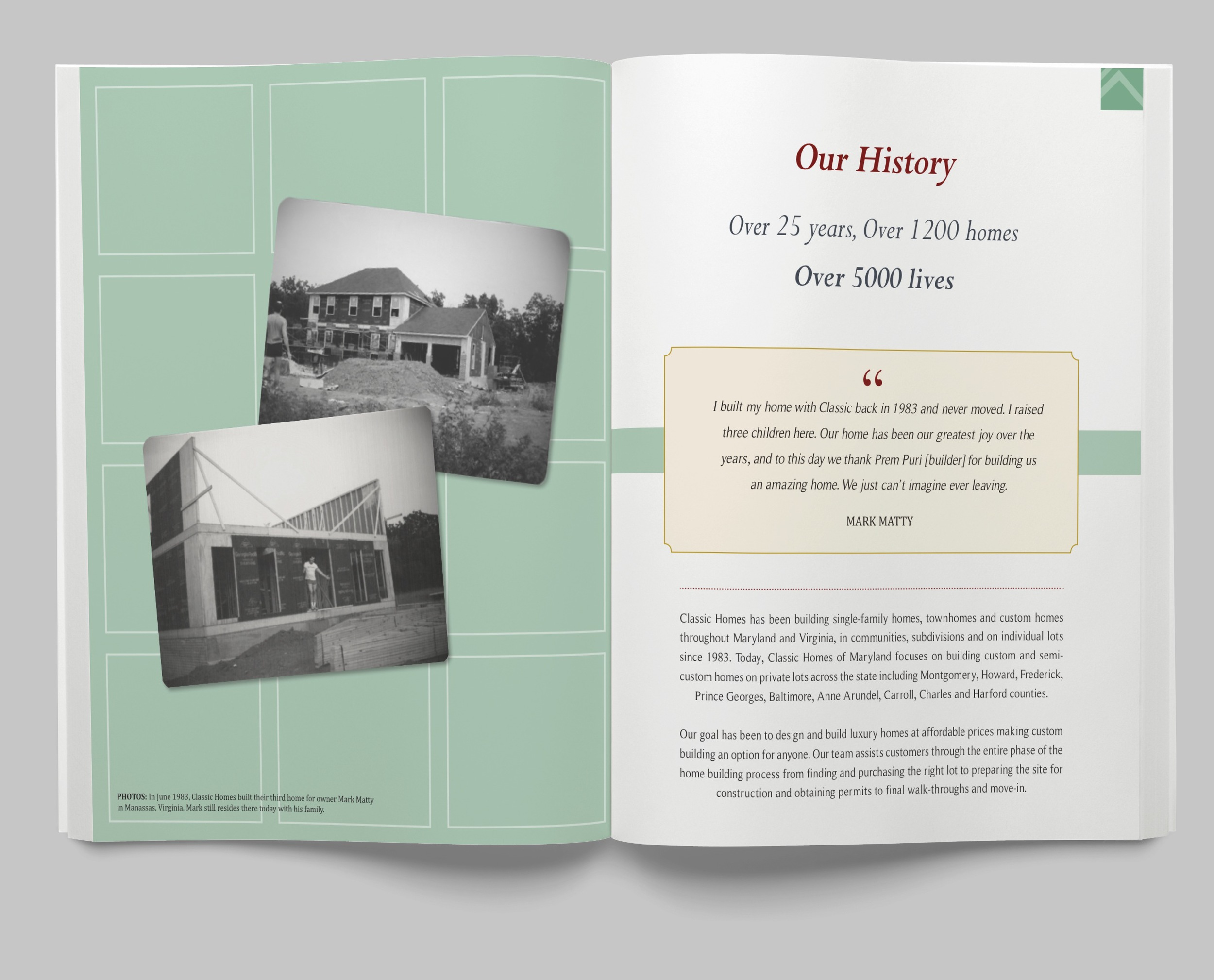
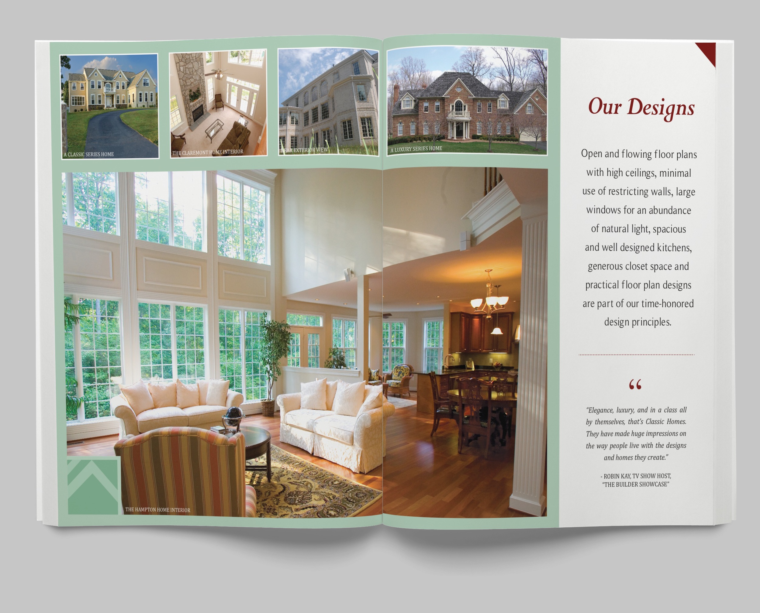
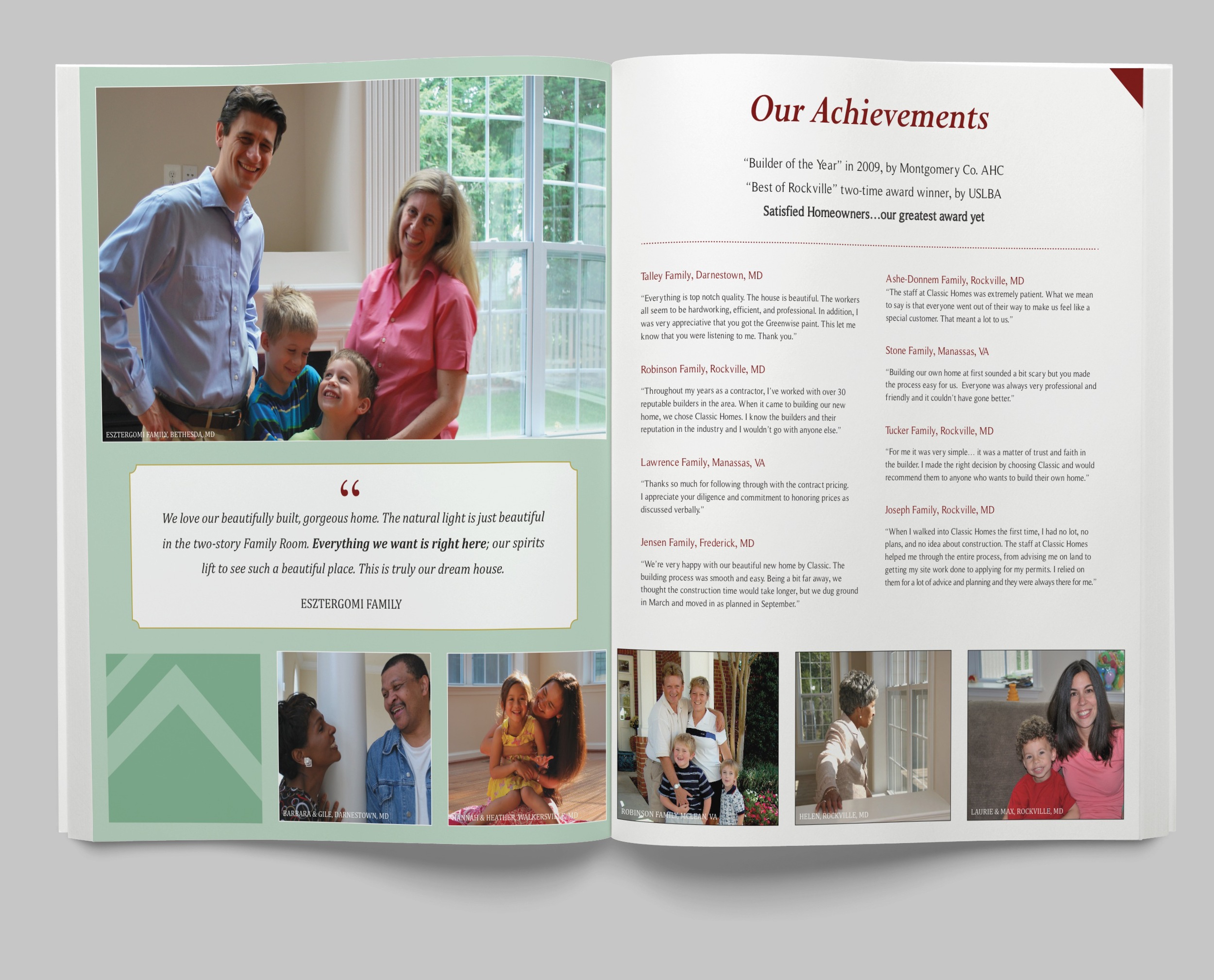
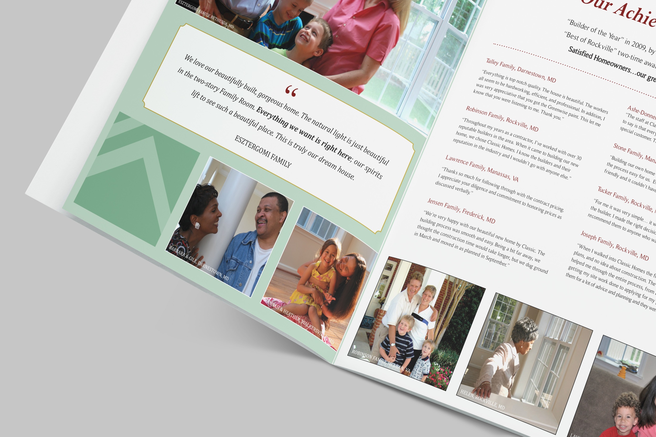
This is a refreshed identity package for Classic Homes of Maryland, a custom home building company. My goal was to communicate a single, cohesive message, representing professionalism, trust and experience, through all of their online and print materials. I refreshed their style sheet, including updating their logos and selecting the color palette and fonts. I also designed their collateral and marketing materials, including their business card, letterhead, envelopes and new sales brochure.
Also show here is the logo and microsite designs for one of Classic Homes' sub-brands, Classic Homes Site Services.
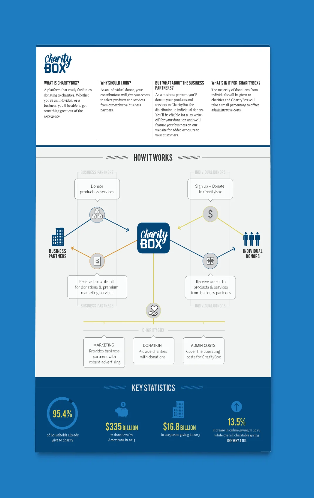
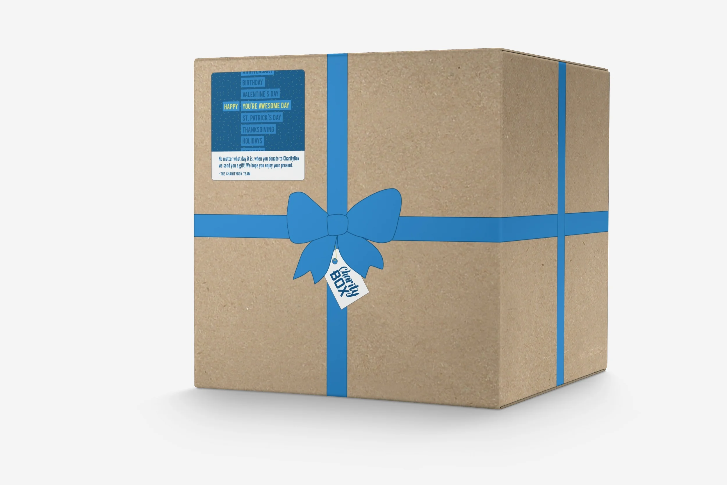
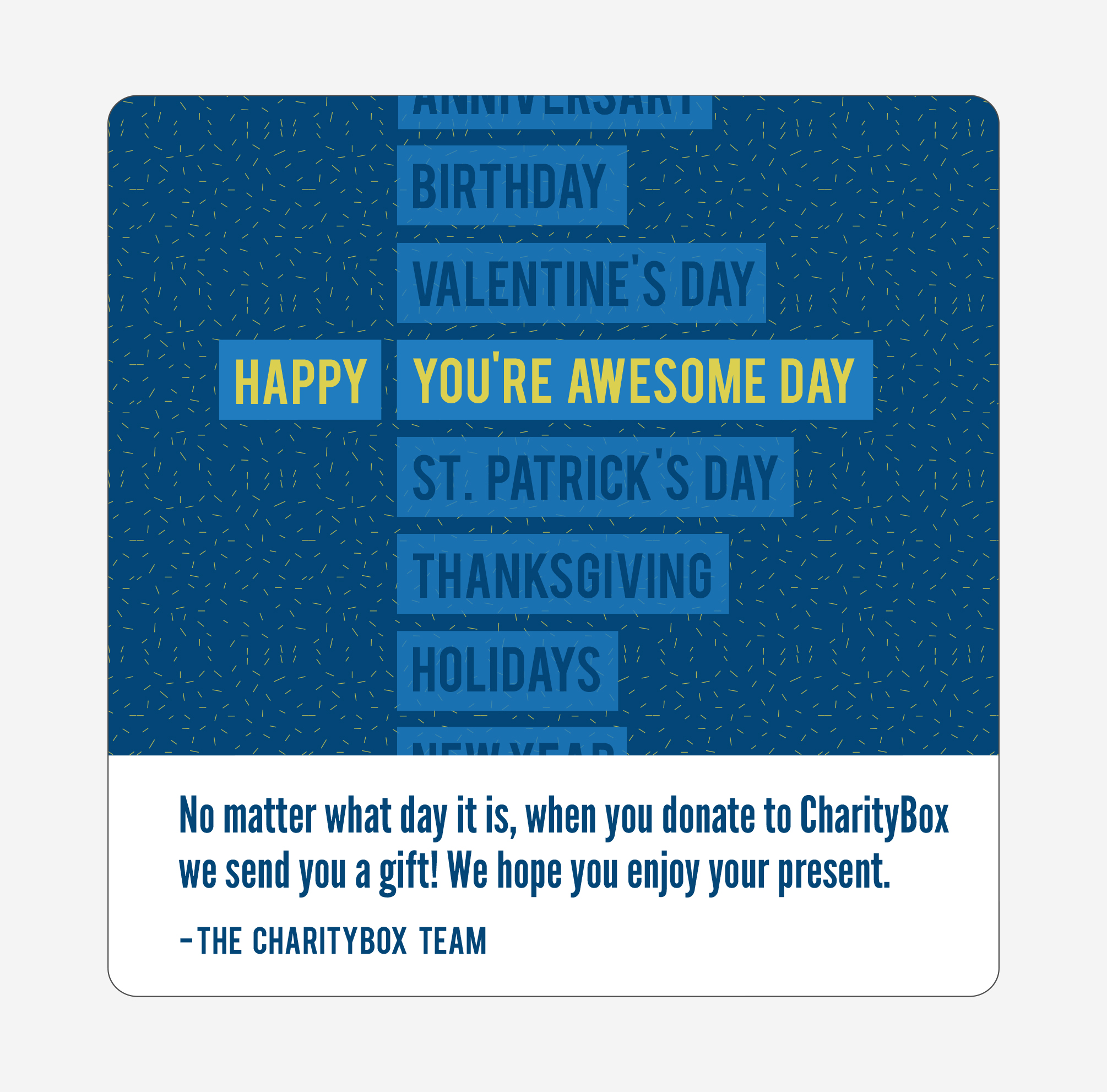
This is a brand identity concept for a charity startup, CharityBox. The organization offers clients the opportunity to donate to a charity of their choice and in return, they receive a gift containing donated products from business partners.
The logo represents the company's product – a gift, both a gift to charity and a gift back to the donor. The font for “charity” is more fluid, similar to a ribbon, which sits on top of the text “box,” which feels sturdier. I added the ribbon-like elements to the letters of the word “box” to emphasize the idea of a gift.
In addition to the identity guide, the mockup includes a one-page summary of the organization, which would be sent to the investors, donors and business partners. Also represented here is CharityBox’s branded gift box that is sent to the donor containing the donated products.
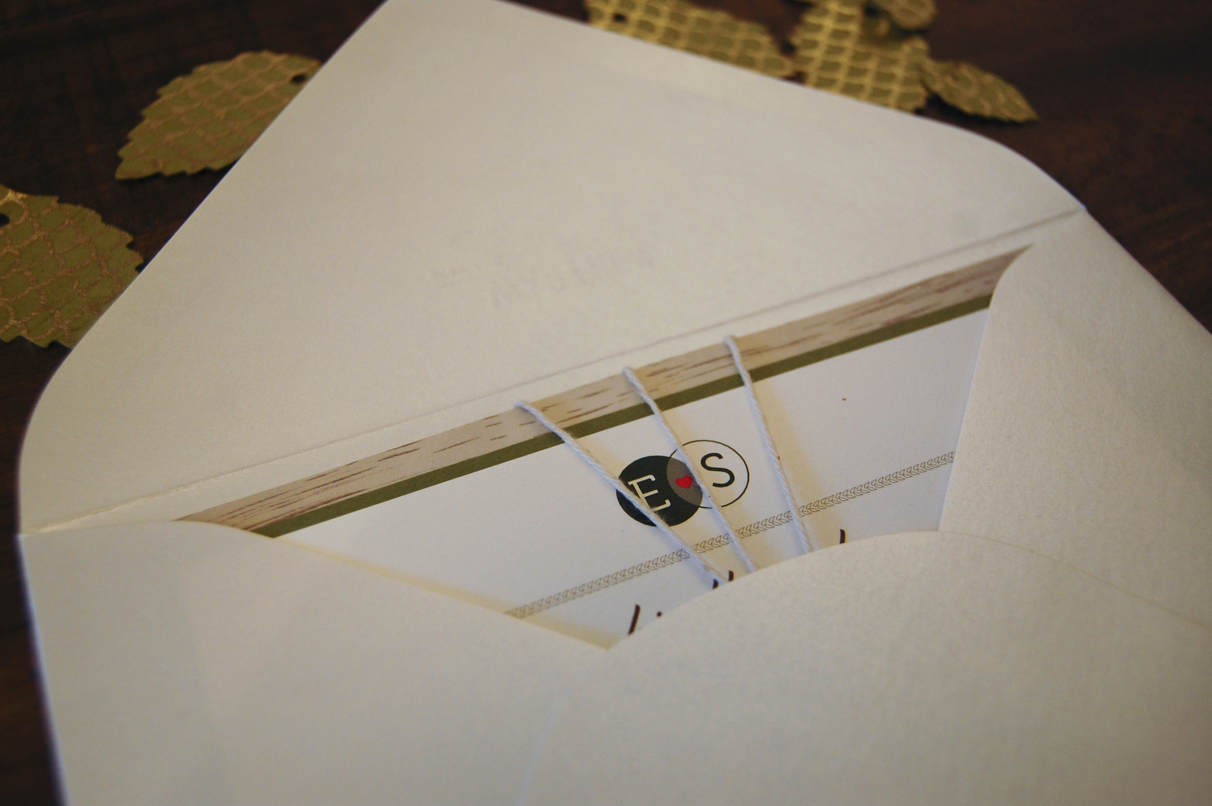
This is a custom wedding invitation for a rustic, fall wedding. The background wood grain is completely unique, created using Illustrator. The paper leaves were hand cut, punched and assembled for each invitation. The concept focuses on the natural setting of the wedding, outdoors, surrounded by trees and nature. Also pictured are the guest seating cards, the ceremony program and the menu card.
This is a custom wedding invitation for a rustic, elegant farm wedding in October 2014. The couple wanted to stay true to their New York background and keep this invitation sophisticated but also add a low key, softer flair that spoke to their personality. I accomplished this by using an elegant, yet causal handwritten font paired with a more formal serif font. The causal nature of the wedding was further emphasized by the hand-drawn border, the hand-stamped rooster and the flower bouquet graphic elements.
In addition to the wedding invitation suite, I designed the save the date postcard, reception menu card and ceremony program.
This is a custom save the date design for Alyssa and Jonathan. This design is inspired by the couple's playful, outgoing character. I chose a bold purple color to match their wedding suite and used a custom pattern of "We're Getting Married" variations. This was an opportunity to do something unique for someone close to me.